A blue sky for Screenhub. Image based on The Truman Show (Director Peter Weir) and altered by Alex Lofting.
According to web archiving tool the Wayback Machine, the last time we had a look at Screenhub’s homepage was back in 2015. That was the year Birdman swooped the Oscars and Miranda Tapsell was best newcomer at the Logies. So a lot has changed in the last 4 years and we thought it was time to give the website a refresh.
We want to stay in touch with our members more closely and meet their needs by developing our focus on video and audio. We will strengthen our coverage of areas like technology, gaming and education as the sector evolves.
The clearest change is the inclusion of a carousel. We have seen it working over at our sister publication, ArtsHub, where it showcases key stories and uses images to create drama. We’ll feature 5-7 stories in the carousel at any time to show what is current in screen media.
The newly launched carousel.
Expanded reviews
We’ve been introducing reviews from critics and writers like Adrian Martin, Mel Campbell, Anthony Morris, Chris Boyd and more. Audiences have loved the reviews and diverse voices on the site, so we are giving them a clear place on the homepage. We wanted to feature authors here so you can find your favourites more easily.
And the stars. It’s an over-simplification to reduce a film down to naught to five icons but we think that should be the start of the story. Here’s what we tell our reviews about the star system:
- Five stars: Exceptional, unforgettable, a must see
- Four and a half stars: Excellent, definitely worth seeing
- Four stars: Accomplished and engrossing but not the best of its kind
- Three and a half stars: Good, clever, well made, but not brilliant
- Three stars: Solid, enjoyable, but unremarkable or flawed
- Two and half stars: Neither good nor bad, just adequate
- Two stars: Not without its moments, but ultimately unsuccessful
- One star: Awful, to be avoided
- Zero stars: Genuinely dreadful, bad on every level

The new reviews panel as it displays on your desktop.
Featured Career section
We have included a space on the front page for careers – not just a job board but a space where we’ll add articles about how you can grow your career with honest advice from industry professionals. But we’ll also advertise jobs here and look at industry opportunities (grants, awards and more) for when you want to make the next step.
All of your favourite regulars like Around the Web or Company Announcements are still on the site but may not be as visible on the homepage.

The Careers panel will be the destination for work and improving skills.
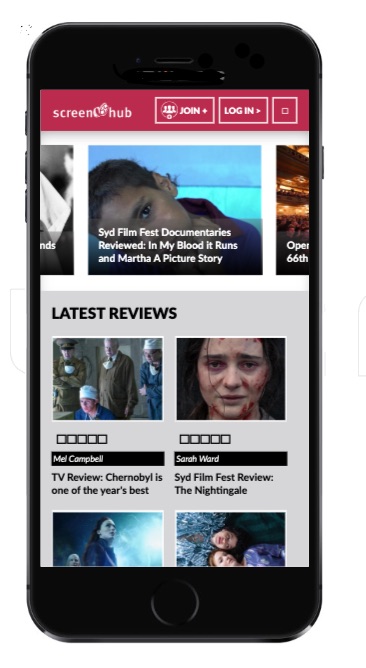
More mobile friendly
Another huge change since we last revamped the website has been the importance of mobile browsing. Most of our audience now looks at the site via mobile so we have updated the design to so it is easier to browse on mobile. Buttons and images are clearer so you can look at the site on the go. You might be browsing reviews while in the line at the cinema or be searching for jobs while on the train home so we are keeping it clear and simple for mobile users.

A mock up of the new site on mobile.
At the core of Screenhub for almost twenty years is our belief that screen media is a fusion of business, career and art. We want to strengthen our commitment to career support and education. But we don’t get it right all the time so we want to hear from you.
If you have any questions about the new Screenhub site send me an email because we’re always improving and there are more changes planned.


